Heart Decor That’s Trending This Season
Outline
– Section 1: Heart Motifs Now: Shapes, Styles, and Meaning — how the heart icon is updated across aesthetics and where it fits at home.
– Section 2: Seasonal Home Decor Strategy — a year‑round rotation framework that prevents clutter.
– Section 3: Materials & Craft — tactile choices, durability, and care.
– Section 4: Color Palettes & Placement — visual balance, scale, and lighting.
– Section 5: Sustainable Styling & Budget — long‑term planning and cost‑savvy methods.
Heart Motifs Now: Shapes, Styles, and Meaning
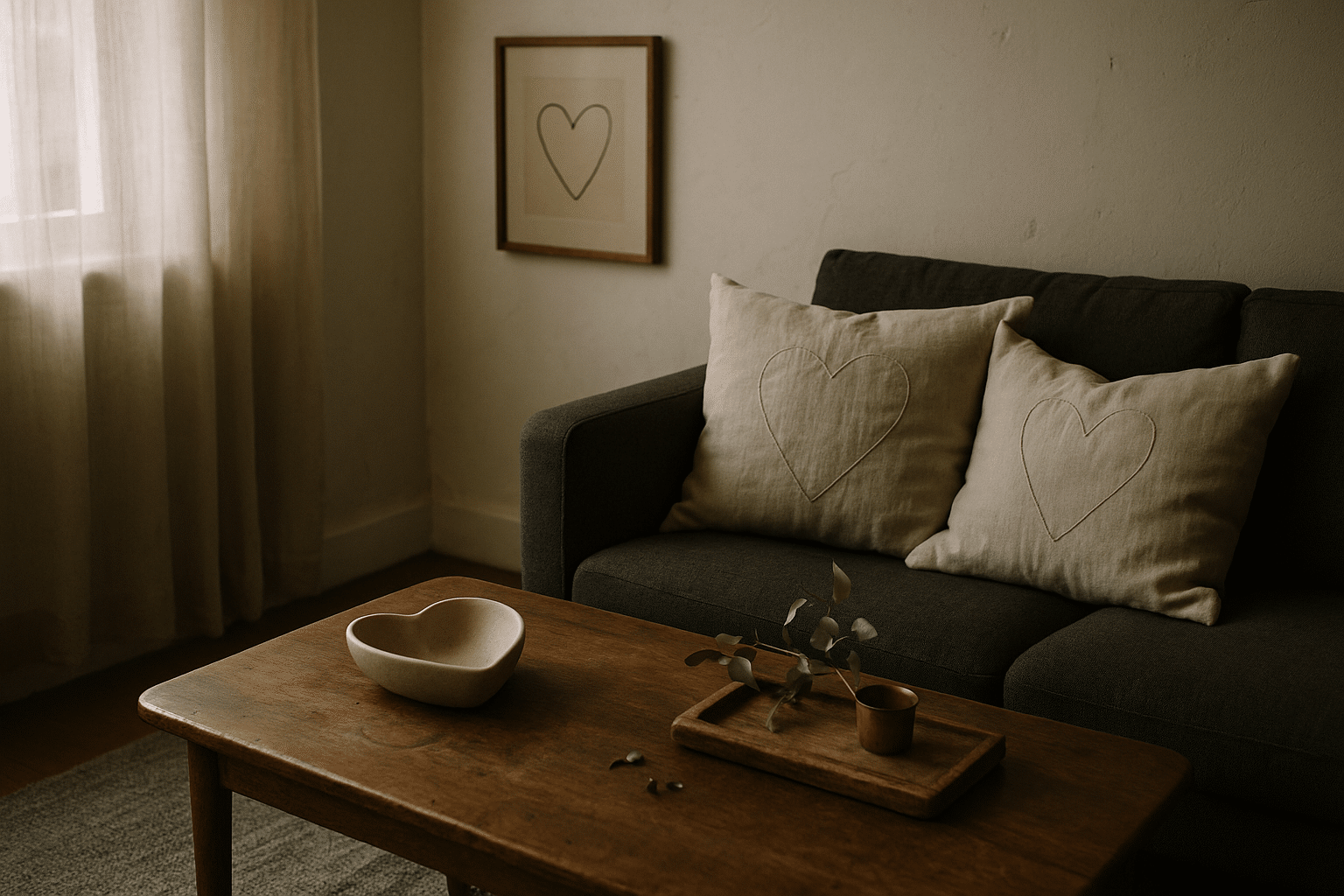
Across interiors, the heart symbol has shifted from seasonal novelty to an everyday accent with personality. Designers are leaning into cleaner silhouettes, matte textures, and tactile details that feel intentional rather than sugary. Minimalist line drawings in black or soft charcoal pair easily with neutrals, while sculptural hearts in stoneware, travertine, or soapstone provide weight and quiet drama. Textiles carry the motif subtly: think tone‑on‑tone quilting, tufted wool loops, or jacquard weaves that reveal the shape only when light hits at an angle. On the playful side, gingham and ditsy florals echo country charm without overwhelming a room; the trick is to keep scale small and colors restrained so the look reads collected, not themed. An overview of heart decor trends discussed this season, covering design styles, materials, and how these decorative elements are commonly used.
Where do these icons thrive? Entry consoles and open shelving are prime spots for a small carved heart or a ceramic catchall. In living rooms, a pair of cushion covers with understated heart stitching can add a friendly note without dominating the sofa. Over the dining table, a cluster of petite heart ornaments hung on natural twine adds visual rhythm; remove them after a month and swap in foliage or fruit to maintain seasonality. Bedrooms benefit from candleholders with embossed heart silhouettes or a single framed print over a bedside table—one focal piece feels considered. For walls, asymmetrical gallery arrangements mix heart sketches with botanicals and landscapes to avoid repetition.
Useful guardrails keep the motif feeling grown‑up:
– Limit to two or three heart references per room.
– Vary materials (one textile, one ceramic, one metal) to create depth.
– Offset curves with linear elements such as ribbed glass, fluted wood, or grid patterns.
The cultural resonance of the heart—affection, care, optimism—makes it a natural counterbalance to hard surfaces and straight lines. Treated as a shape rather than a slogan, it slots into modern, rustic, or eclectic rooms with ease, offering a small but noticeable lift that reads as welcoming rather than kitsch.
Seasonal Home Decor Strategy: Rotate, Layer, Refresh
Seasonal home decor works best when guided by a repeatable framework. Start with a stable base layer—neutral rugs, solid curtains, and foundational furniture—so accents can rotate without visual chaos. Then set a seasonal cadence: early spring emphasizes freshness and light; high summer embraces airy textures; autumn brings warmth and density; winter favors glow and comfort. Instead of changing everything at once, identify four anchor zones to refresh each quarter: the entry, sofa, dining surface, and a bedroom vignette. This targeted approach delivers high impact with modest effort.
Here’s a practical rotation map:
– Spring: cotton throws, petite bud vases, and pale wood trays. A small heart garland in raw linen softens hard edges.
– Summer: woven baskets, seagrass mats, and coastal‑inspired ceramics. Replace heart prints with heart‑shaped leaves (philodendron or pothos) for a botanical nod.
– Autumn: amber glass, wool pillows, and carved wood accents. A stoneware heart bowl doubles as a key drop and centerpiece.
– Winter: brass candlesticks, velvet cushions, and layered lighting. Hang a subtle heart ornament from a cabinet knob to add glow without clutter.
Scale and proportion matter as seasons change. Light reads visually larger, so in bright months use fewer items with more negative space; in darker months, layer textures to add intimacy. Group accents in odd numbers for natural balance and keep vertical rhythm by staggering heights—tray, medium object, tall stem. Containers pull everything together: a wooden tray in fall, a rattan tray in summer, a lacquered slab in winter. To avoid storage bloat, prefer textiles with reversible patterns and accents with year‑round utility (a heart‑rimmed bowl that also serves snacks, for instance). Label bins by zone rather than season—“Sofa,” “Entry,” “Table”—to simplify swaps. The outcome is a home that evolves gracefully, feels intentional, and keeps decorative accents working hard across the calendar.
Materials & Craft: Texture, Durability, and Care
The story of decorative accents is as much about hand and heft as it is about shape. Natural fibers—linen, cotton, jute, wool—offer breathability and soft, light‑diffusing textures. Linen pillow covers with stitched hearts drape elegantly and resist pilling; cotton holds crisp prints; wool adds loft and quiet acoustic benefits, which is handy in echo‑prone spaces. In hard materials, stoneware and terracotta bring earthy weight; glazed finishes clean easily, while satin or matte glazes minimize glare. Woods like oak and ash accept gentle carving, making small heart trays and wall plaques that develop a lived‑in patina. Metalloids such as brass or aluminum add highlight and contrast when used sparingly in candle cups or picture frames.
Performance varies by room. Kitchens benefit from sealed stoneware that resists staining; entries appreciate hardwood trays with wipeable oil finishes; bedrooms welcome washable textiles. Care routines are straightforward:
– Vacuum textiles with a brush attachment weekly to preserve nap.
– Spot‑clean wool with cool water and mild soap; avoid agitation.
– Refresh wood with a plant‑based oil; test a hidden edge first.
– For matte ceramics, use non‑abrasive cloths to maintain a soft sheen.
Sourcing matters too. Small‑batch ceramics often show charming irregularities—pinholes, slight glaze pooling—that read as character rather than flaw. Reclaimed woods may include butterfly joints or color variation; pair them with smoother surfaces to avoid visual noise. If indoor air quality is a priority, look for low‑VOC sealants on wood pieces and avoid synthetic fragrances in candles. An overview of heart decor trends discussed this season, covering design styles, materials, and how these decorative elements are commonly used.
DIY can stretch budgets without sacrificing quality. Simple projects include a quilted pillow with a tone‑on‑tone heart panel, a clay trinket dish formed over a bowl and left with fingertip marks for texture, or a painted plywood plaque sealed with wax. These crafts emphasize tactile richness, invite personal meaning, and allow you to tailor the palette so accents harmonize with existing furniture rather than competing for attention.
Color Palettes & Placement: Balancing Charm with Clarity
Palette sets the mood and determines whether heart decor feels refined or sugary. Monochrome schemes—charcoal, ivory, and warm gray—give line‑art hearts a gallery vibe and keep rooms calm. Complementary pairings (dusty rose with sage, terracotta with powder blue) provide tension that reads modern. Triadic palettes (soft red, muted teal, warm mustard) energize eclectic rooms when distributed judiciously across textiles, ceramics, and art. Aim for a 60/30/10 ratio: 60 percent base, 30 percent secondary, 10 percent accent. Hearts generally belong in the 10 percent, ensuring charm without takeover.
Placement turns theory into impact. In compact spaces, concentrate accents within a single sightline—say, the sofa wall—to avoid visual scatter. Mount art at eye level (roughly 57 inches from floor to center) and keep at least a hand’s width between frames so shapes can breathe. On shelves, use the triangle method: position a heart object low left, a taller neutral mid shelf, and a small echo high right to create movement. Consider light: matte finishes thrive near windows where reflections can distract, while metallic accents glow in indirect corners. If a room lacks natural light, select paler hues and open‑weave fabrics so forms remain legible without adding lamps.
Small rules that prevent clutter:
– Repeat a hue at least twice in the room, even if in different textures.
– Swap like for like (pillow for pillow, tray for tray) during seasonal refreshes to maintain balance.
– Anchor whimsical pieces with grounded materials—stone, wood, or iron—so the overall read stays sophisticated.
Case example: a living room with ecru walls, a walnut coffee table, and slate rug. Add two linen cushions with stitched hearts in clay, a matte stoneware heart bowl for remotes, and a graphite line‑art print over the sofa. Because all hearts sit within a narrow palette and varied textures, the scene feels cohesive. The motif is present, but the eye still lands on the room’s architecture and the comfortable proportions that make daily living easy.
Sustainable Styling and Budget‑Savvy Tips
A polished, personal look doesn’t require constant shopping; it rewards planning and restraint. Start by defining a yearly accent plan: four micro‑updates tied to the seasons, each with a modest spend and a storage strategy. Prioritize versatile pieces—reversible cushion covers, neutral throws, ceramic bowls—that work across months, then sprinkle in heart motifs where they’ll spark delight. Thrifting and swaps add depth and keep items out of landfills; patina in wood trays, crazing in ceramic glazes, and sun‑softened textiles supply character that new items rarely match. Track what you own in a simple inventory so duplicates are avoided and gaps are easy to address.
Budget frameworks keep choices clear:
– Capsule accent kit: 2 pillow covers, 1 throw, 1 tray, 1 small sculptural piece per season.
– Material priorities: 70% durable basics, 20% seasonal color hits, 10% whimsical shapes (including hearts).
– Time allocation: one hour per quarter to edit, clean, and reset vignettes.
Stretching value often comes from care, not cost. Wash textiles in cool water, sun‑air them to refresh fibers, and rotate cushions to even wear. Re‑oil wood once or twice a year; minor scratches become a narrative rather than a flaw. If you paint, use leftover wall paint to unify frames or trays so disparate pieces feel like a set. For renters, removable hooks and ledges allow seasonal art swaps without damage, and narrow console tables create staging spots for small heart objects that can be cleared when entertaining.
Eco‑considerate choices include natural fibers, recycled glass, and reclaimed woods. Local makers reduce shipping impact and often repair their own work, extending life spans. When you do buy, choose items with enduring silhouettes and quiet finishes so they can migrate from entry to bedroom over time. An overview of heart decor trends discussed this season, covering design styles, materials, and how these decorative elements are commonly used. With that compass, decorative accents become a flexible toolkit: easy to rotate, simple to store, and satisfying to live with throughout the year.


